
Under the covers
Choosing a cover for your latest work can be a bit of a nightmare. The saying, ‘you can’t judge a book by its cover’ is quaint, but if your book has a lousy cover, chances are people may think it’s lousy on the inside as well. Even though I’ve always thought ‘simple is best’, the covers of my books can be complex. In future, I’m going to try and make them simpler (yeah – right, just like I’m going to stop trying on shoes I know I’ll never wear).
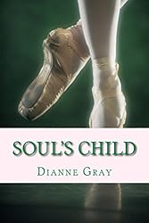
The cover to my latest novel Soul’s Child was produced by Australian artist Richelle Eaton. She created the picture in pastels. It is dark and foreboding, but this reflects the nature of the story. She has an animation on youtube that the artists out there may be interested in which shows the creation of the piece (I think it’s pretty cool).
Creating a cover can be almost as hard as writing the story itself. A picture paints a thousand words (I’m outdoing myself today with sayings) and the cover of the book is the front door to the story. If you’re writing about werewolves I don’t think putting a picture of Creamy Potato Bake is going to sell what’s really on the inside. Having said that, I love that dish so it may be a best seller to me!
The photo at the top of this page was taken of myself and hubby and kids a few years back when we lived on the farm in Queensland. It’s always been one of my hubby’s favourites (because he has his back to the camera), whereas my mother has always disliked it because my eldest son is standing ‘away’ from the rest of us and every time she sees it she feels he’s being left out and he looks lonely.
In actual fact, our positioning had nothing to do with how we wanted to stand and where we wanted to be – the photographer set up the entire scene. But this is a good example of a picture telling the story. I could take that picture and put a title to it to attract a reader to a story. If I called it ‘My Life as an Outcast’ you may think it’s either about the boy on the left or the man in the middle with his back to the camera. It could be called ‘Lost Hope’ which would make it a very forlorn and lonely looking picture, or it could be ‘My Life Before I Won the Lottery,’ and the picture would change again to have a more uplifting feel to it. But if I called it ‘Dog Training in the City’ the reader would have to tilt their head from side to side a few times and scratch it and wonder what on earth the picture has to do with the subject matter.
This is a good test for anyone thinking of choosing a cover for their book. Take a look at different pictures and imagine what the book would be called. It can be pretty funny at times!
Good luck 🙂


Great Read, Your articles are like step by step tutorial to writing a good book. thank you for sharing.
LikeLike
Thank you, BC. I love reading your blog. You have a beautiful and natural way with words and emotions – looking forward to reading a lot more
LikeLike
Wow, coming that from you! its simply wow! Thank you, Thank you. You made my day!
LikeLike
This is kinda off the path here but, while reading this I couldn’t help but catch and keep thinking of the fact your husband and children support you and that— is what we ALL need in life. totally cool!!!!
LikeLike
That is SO true. I have a very supportive family. The picture at the top of my page was actually on the front page of a newspaper a few years back. The day the newspaper came out my daughter went to school and on the blackboard someone had written ‘I hold my mummy’s hand’. She was pretty upset about it at the time, but now we laugh about it (and still hold hands proudly!)
LikeLike